There is a reason why some photos are better in black and white—they’re more powerful that way. When you strip them of color, what remains are the details, the shadows, the light, the emotions. And sometimes, these things speak louder.
And then there are times when keeping the colors makes an image speak louder. From colors of healing to the color of loyalty, there’s so much to discover. Colors trigger emotions, and they affect the story each image tells. This is why creative teams must be mindful of color, how it impacts people, and how it affects the visuals they produce.
Different Types of Colors
Colors provide the framework of any visual element. There are three sets of colors: primary, secondary, and tertiary. This may sound basic, but it helps designers and visual artists navigate through color theory.
Primary colors include red, yellow, and blue. Red attracts the most attention, often triggering strong emotions like love and anger, and signifies power and courage. Yellow is all about lightness, happiness, and a positive mood. Blue is a color that evokes the mind in its unique way. It brings clarity and calm and triggers some sense of security and assurance.
Secondary colors are a combination of primary colors. Red and yellow gives you orange, which is a color of excitement and energy. Red and blue gives you violet, which is often associated with the future. This is why futuristic design almost always has a touch of violet. Blue and yellow give you green, which is a relaxing color. It is visually pleasing and is associated with freshness and growth. Tertiary colors are a combination of primary and secondary colors, and it only becomes wider and broader from there.
Color and Emotion: Key Color Associations
Elevating your visual projects starts with figuring out which colors will better serve your image or design and simultaneously trigger the right emotions in your audience. As a brand, it’s not just about using highly curated images; it’s also about studying the colors dominant in those images and making sure they’re in line with your brand identity.
Healing Colors
99Designs reported that almost 85% of the leading healthcare businesses feature blue in their logos. Pfizer, McKesson, and even healthcare publication WebMD all feature the color blue in their logo because they know it gives off that sense of calm and healing, not to mention it’s a color of trust.
Colors of Hope
McDonalds, Bumble, and National Geographic pour feelings of optimism and hope into their audience through their yellow logo. Maybe they knew this at the onset, maybe not. But their their choice of logo color effectively work to their benefit because it’s easy to the eyes and triggers happiness.
Colors of Protection
The timelessness of black and silver not only makes it a solid color of protection but also gives off that impression of power. It is associated with security and authority, and brands like Lexus, Mercedes-Benz, and Honda knew all about it. It’s like they’re saying, “There is safety and protection in our products,” or, to be more specific, “in the cars we build.” Other non-automotive brands that want to be associated with safety and protection include L’Oréal, Nike, and Gillette.
Energizing Colors
From Coca-Cola to DHL, these brands know exactly what they want people to feel when seeing their logo—hyped, alert, and energized. It’s as if they’re triggering people to take action immediately. For Coke, it’s to grab a can, drink, and feel energized. For DHL, it’s to head to their nearest location, send a package, and know it’ll be shipped fast. These brand logos scream energy, movement, and action.
Yellow is also a color of energy and DHL clearly made a smart move by combining yellow and red. Other brands like Nikon, Mcdonald’s, Shell, and Mailchimp all incorporated yellow in their brands. Because of that, people tend to associate action and energy with them.
Power Colors
If you want your brand to be associated with power and command, you’d want to go with red, black, gold, or a combination of these. Take Dove, for example. Their logo symbol of a bird may signify sophistication and elegance, but the color is all about power, as if to say, “we’re here and we’re here for a reason.”
In 2018, Hypebeast reported that Supreme tops the list of most powerful logos. The streetwear company’s red box logo never fails to give off that strong vibe without coming off too strong as they balanced it with white typography.
Love Colors
Unlike red, black, and yellow, not many brands choose pink for their logos. Perhaps because it’s seen as a soft color and most brands want to be associciated with either strong and powerful energies, or they want to be perceived as fun and energizing. But being the color of love, pink actually isn’t a bad color.
Think Dunkin’ Donuts, Barbie, and appliance brand LG—their logos are not so bad. In fact, it’s refreshing to see these pink logos and these brands know their logo color would make people associate them with a calm and chill type of love.
Mood Colors
Different colors trigger different moods, and this is one of the main basis brands have when choosing their logo color, the colors in their website, photos used for their social media posts, and other visual items they associate themselves with.
McDonald’s yellow logo want you to feel hungry and energized enough to stop by one of their branches and order food you’ll surely love (yes, that’s inspired by their slogan, “lovin’ it.”) Target red and white bullseye wants you to know there’s always action and something to check out in their stores. And Orange Theory wants to trigger excitement and fun with their orange logo, often associated with liveliness. You may not feel energized enough to workout but their logo will surely trigger gym excitement in you.
Passionate Colors
Warm colors like red, yellow, and orange are known to evoke passion and optimism. So you can say Amazon is telling you they’re passionate to “work hard and have fun” (yes again, part of their slogan), add to that the arrow shape in their logo that represents customer satisfaction.
Lots of food brands use red their logos to signal people they’re passionate about serving good food. These brands know that having red as a dominant color in their logo will effectively incorporate passion in their brand identity. And in the food business, isn’t that what we all want?
Colors of Happiness
If you want your brand associated with happiness, you’d want to stay close to red, yellow, and orange. Coca-Cola is associated with optimism, happiness, and energy because of their brand color paired with a distinctive Spencerian script logo name. Yellow is also strongly associated with happiness and many retail and consumer goods brands like Best Buy, Nikon, and Chupa Chups want you to feel exactly that when purchasing their products.
Colors of Kindness
While many brands want to evoke strong emotions like happiness and excitement, some brands simply want people to feel calm and safe. They want their brand to be associated with gentleness, kindness, and compasion. Most eco-friendly brands use green for their logo to stress out their kindness towards the environment, and they want to share that kindness with you. Best example of this is Whole Foods.
Colors of Loyalty
Like other businesses, healthcare brands use colors to trigger the right emotions in their audience and clients. UnitedHealth Group, Pfizer, and Elevance Health use shades of blue in their logos because they know this color is all about loyalty, trust, and diligence—three things they want to be known for. Pfizer and Elevance Health combined a darker and lighter shade, with the darker one being close to black that triggers power.
To maintain a very solid brand identity, one thing these three brands have in common is that their digital presence is very neat. They simply stuck with blue and combined it with simple colors like white and black, which brings out a sense of cleanliness and stability.
Color in Visual Storytelling
With this strong connection between color and emotions, designers and creative directors are challenged to create designs based on good color themes or palettes. And just because a palette is good doesn’t mean the design is, too. You’d want to ensure your color choices support the kind of story your image wants to tell.
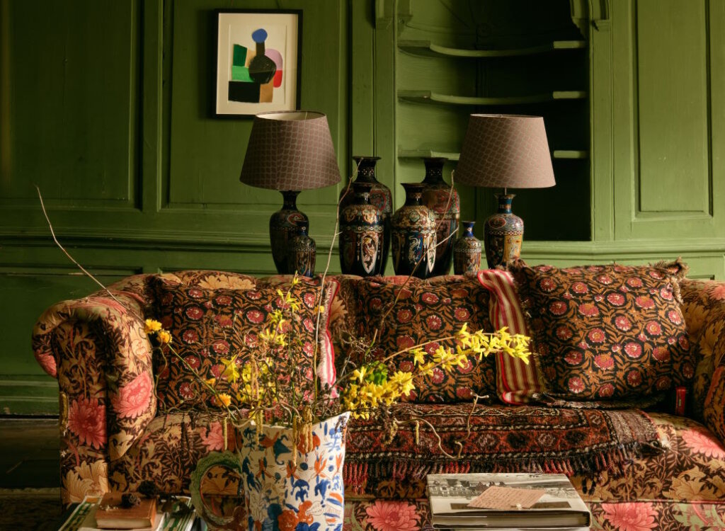
This lifestyle photo is a very casual image, but the orange, almost red rug pulls the viewers in. The various shades of white and gray maintain neutrality, calmness, and simplicity, while the hint of green adds life to the whole image.
This image of the streets at night is a good one, with so much blackness but still full of color. The bright blue-green and red are great attention grabbers, especially with how the lights from the traffic lights and the bus’s headlights reflect on the ground. The touches of orange, some yellow, which is a color of hope, and purple balance the photo out. And that is the key— to find that balance.
Applying Colors in Visual Storytelling
One of the ways visual artists achieve a well-balanced photo is by combining the right colors that match the visual’s story. It’s not enough to find the right palette, make sure that the palette matches your image or design.
Another tip is to play with saturation and contrast. When editing photos, don’t be afraid to go too high or too low with your saturation and contrast. Play with the shadows, see how it affects the overall image. Do the same with the brightness. Editing should be just as fun as shooting images.
Lastly, ask yourself: am I feeling what I want my viewers to feel? When you look at the photo you finished editing or the design your team just completed, do you feel exactly how you want your audience to feel? If it’s a product launch series of images, do you feel excited, captivated, and interested in the product? Or is it just another boring set of images of hairspray? Or loafers… Or handbags…
Put yourself in your audience’s shoes, turn off the tunnel vision, and be honest with how you feel about the project.
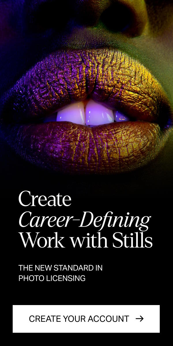
Tired of using bleak stock images?
Try Stills, a photo licensing platform for exceptional designers.
The New Standard in Photo Licensing
Mastering the Power of Color
Understanding how colors work is vital. The emotional power of color in visual storytelling will die down if visual artists don’t pay close attention to various color concepts.
Like color grading or the post-production process where you play with the color tone to see which setting best fits the image and portrays the mood you want. This is when you adjust the hue, saturation, highlights, and other elements to achieve a certain mood for the entire image so it is visually pleasing and evokes the emotions you want.
Color correction is often done before color grading. Unlike color grading, which is basically the finishing touches, color correction is when you work on the white balance, exposure, and other adjustments to make the photo well-balanced.
Another important concept is color harmony or the combination of colors in the image. There are four types of color harmony:
- Complementary color harmony: having colors that complement each other
- Monochromatic color harmony: where there is a heavy focus on one color, and tints, shades, and tones of that same color are added to create a color scheme.
- Triadic color harmony: where there is one dominant color and two accent colors or three colors evenly spaced out in the color wheel.
- Analogous color harmony: or colors that are adjacent to each other in the color wheel that give a harmonious look.
Finding the right mood colors will create that unified look that every good photo has to have.
Conclusion
With so many different types of colors and color combinations, it can be overwhelming for visual artists when creating an image or editing a photo. But with practice and deliberately exposing yourself to images that challenge what you already know in photography, you will better understand the emotional power of color in visual storytelling. You will better understand how colors impact a brand by evoking the right emotions.
License the cover image via Roman Fox