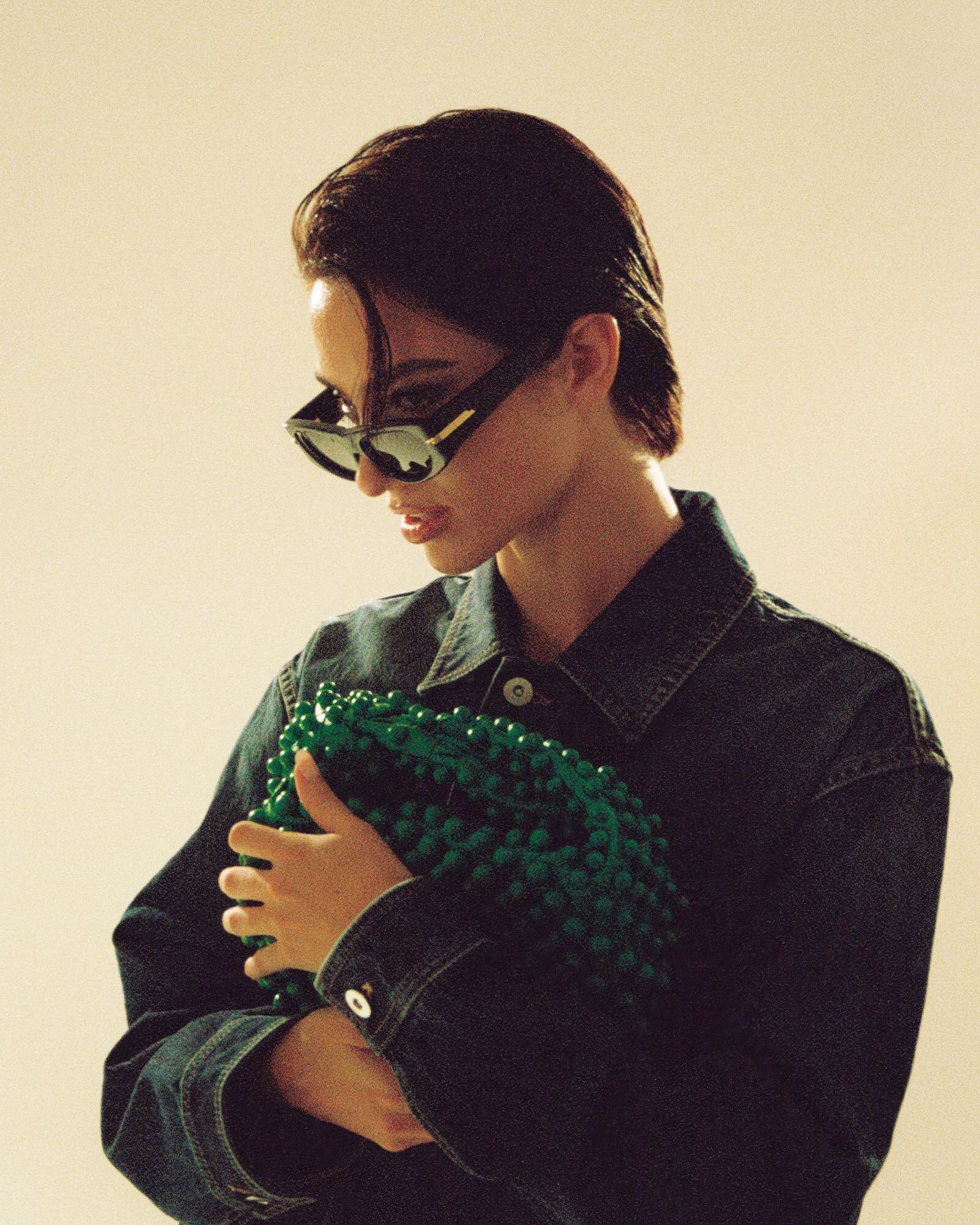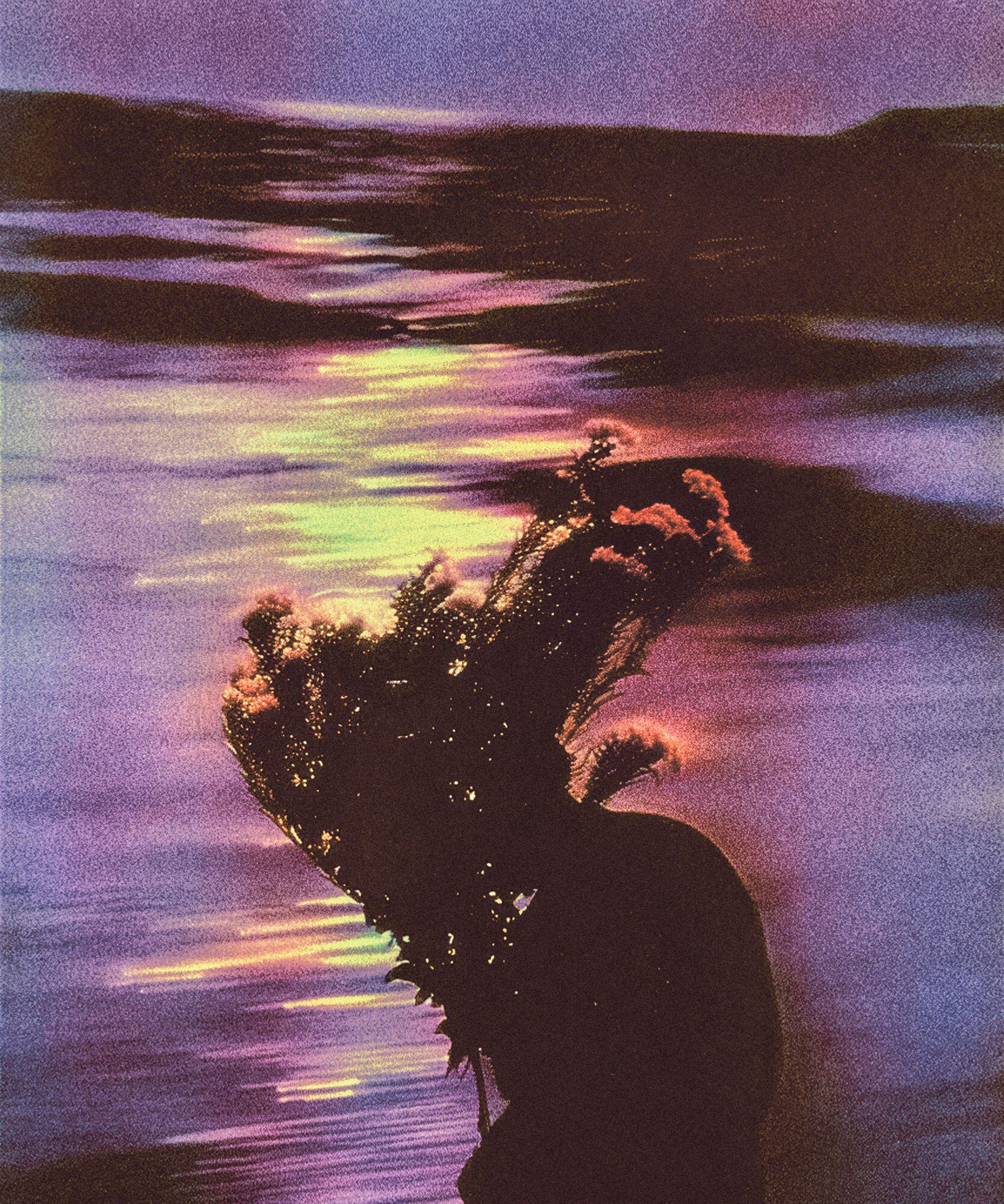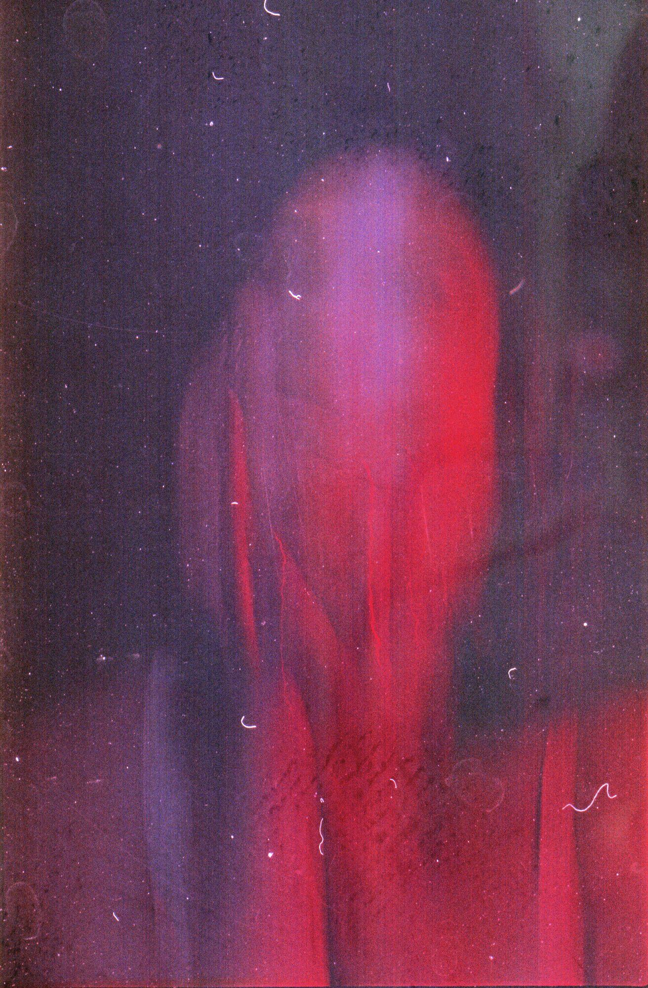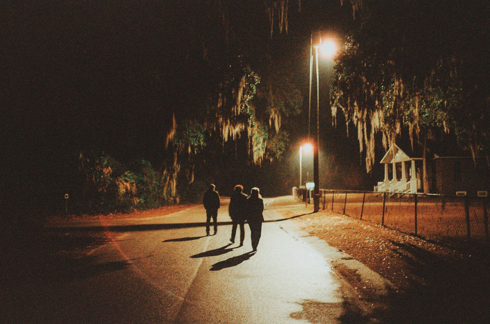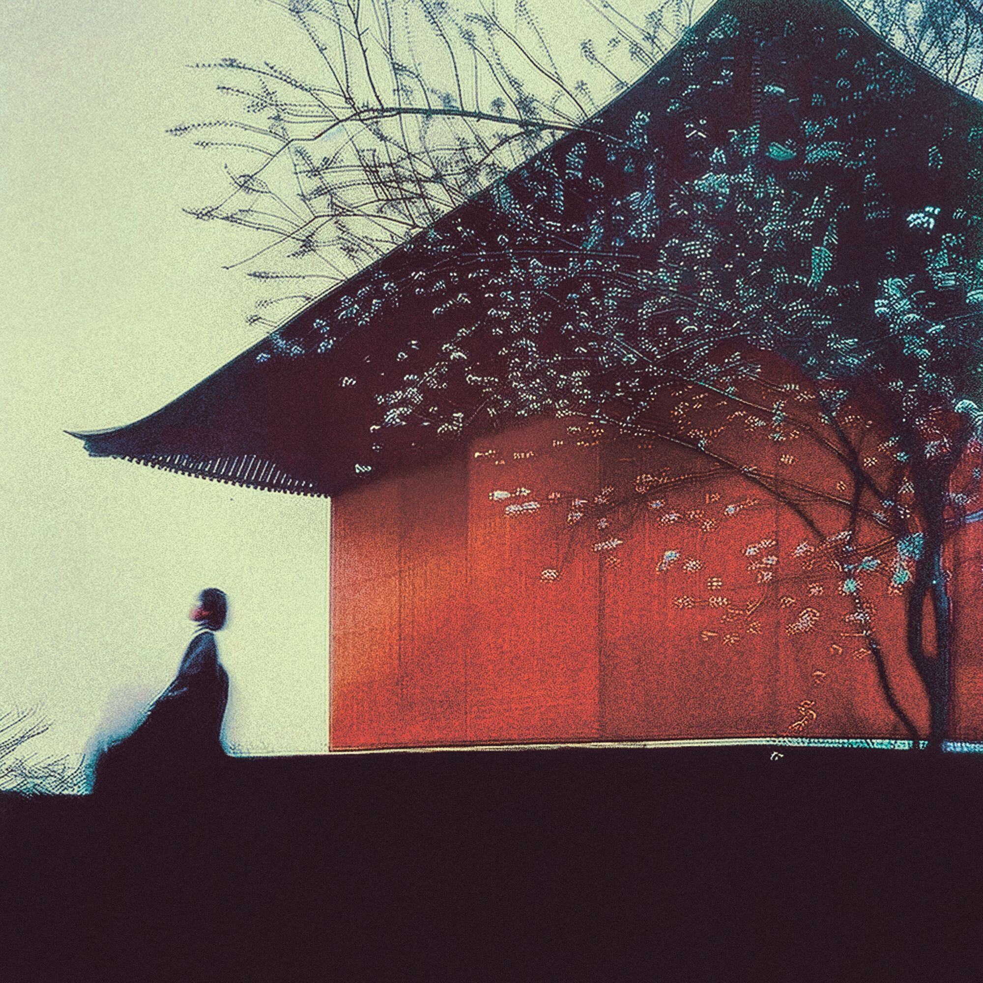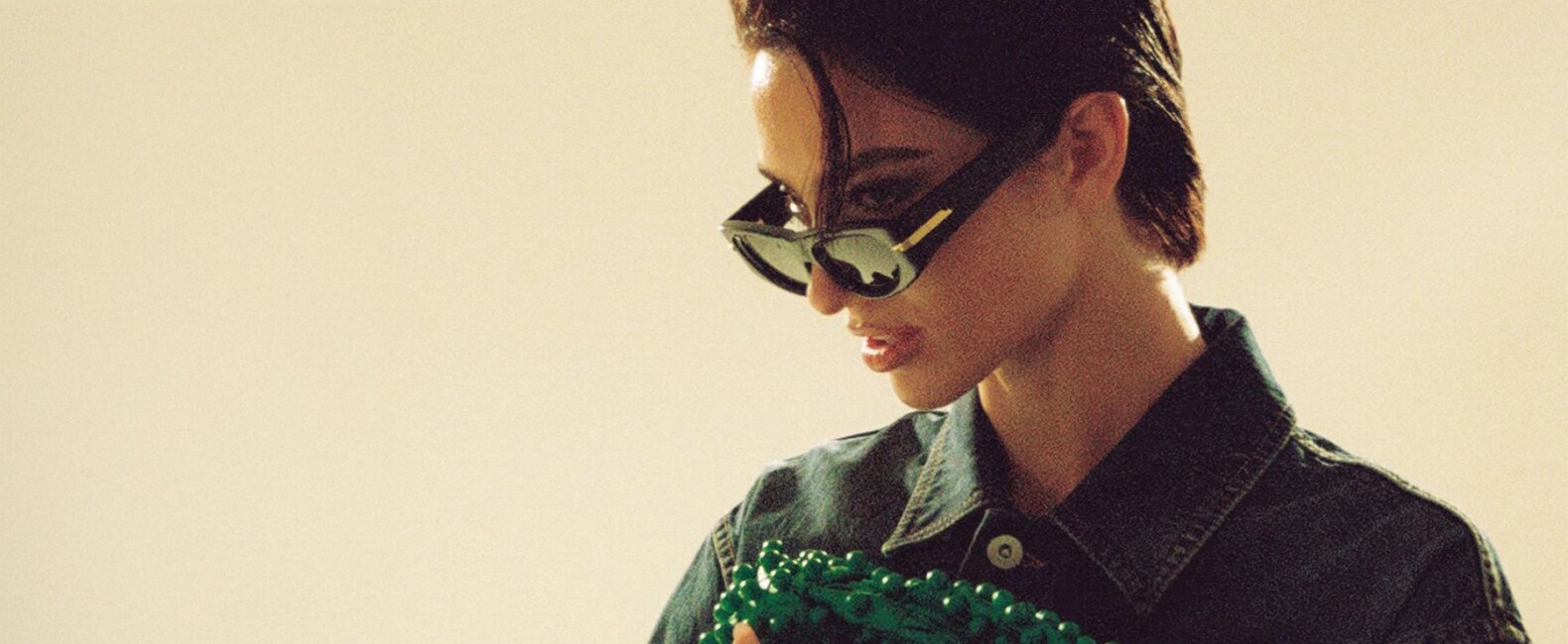
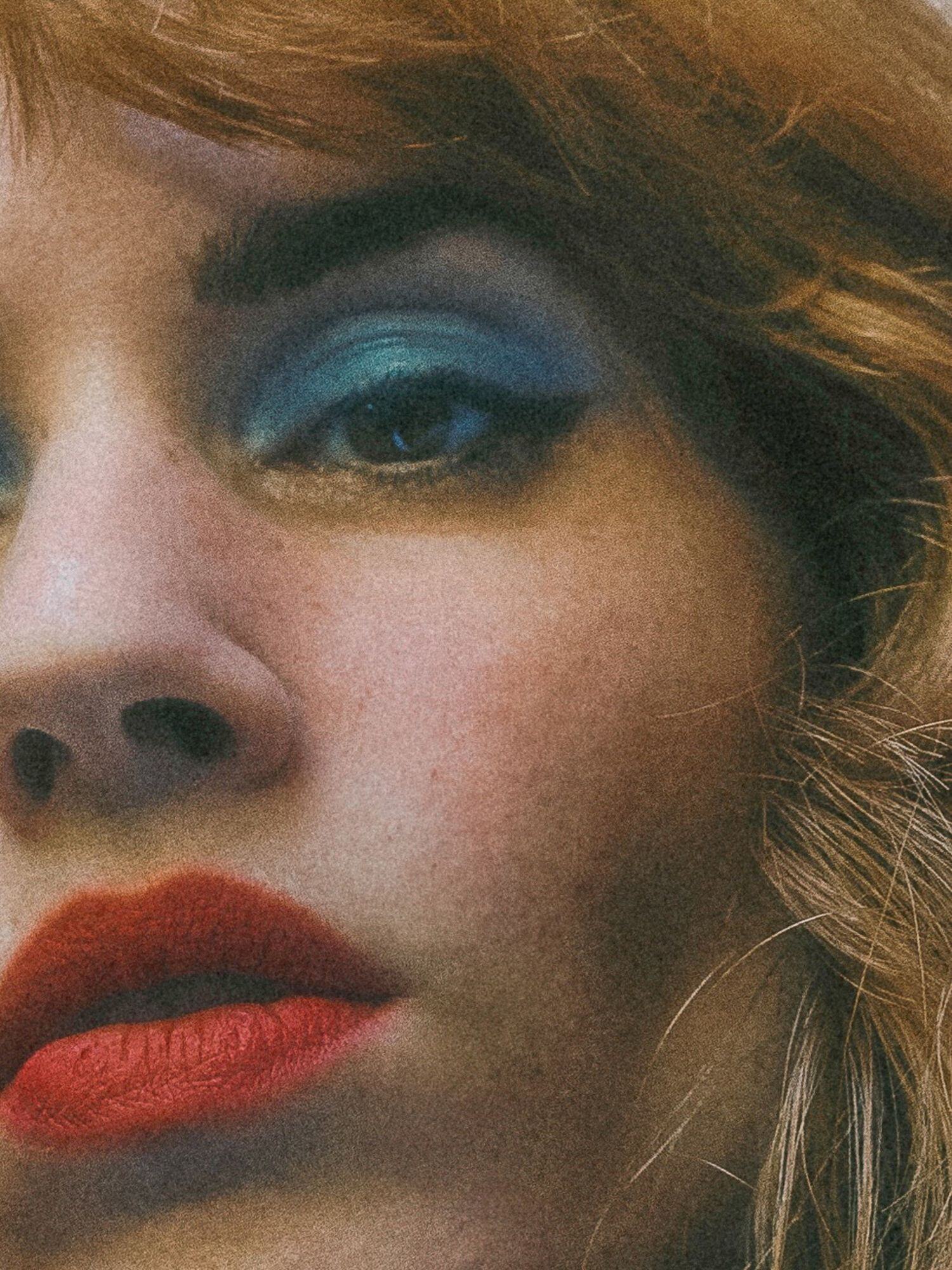
JPEG artifacts—those messy compression glitches we used to avoid at all costs—are suddenly a visual flex. From album art to ad campaigns, designers are embracing imperfection in bold new ways.
And why not?
It’s gritty.
It’s nostalgic.
It’s refreshingly human.
So why does this aesthetic work so well right now? Let’s break it down.
Why the “JPEG Artifacts Look” Works Right Now
Let’s set the scene. We live in a visual culture that’s too clean. Everything is optimized, filtered, and algorithm-approved, so when something unpolished shows up on screen, it grabs you.
“We’re seeing a significant shift from digital to ‘IRL’ culture,” says London-based designer Joe Diver. “People are rejecting hyper-modernity and embracing a sense of grounded tradition.”
JPEG artifacts tap into that desire to feel something real. They bring the early internet into today’s design, creating texture and tension that’s hard to ignore. They look like something you found—not something a creative director spent weeks approving.
RELATED READS: Beyond Aesthetics: How Joe Diver Balances Vision with Brand Legacy

Relevant Design Is Never Accidental
Being relevant doesn’t mean chasing trends. It means using the tools of now to tell stories that resonate.
JPEG artifacts are having a moment because they speak to something deeper: our craving for work that feels real, raw, and imperfect in the best way. Use them not to copy the trend but to say something true about your message, your mood, or your memory.
Here are five reasons why using JPEG artifacts the right way—intentionally, artfully, with just the right amount of chaos—resonates with audiences.


1. JPEG Artifacts Tap Into Early-Internet Nostalgia
We all remember the grainy screenshots, slow-loading images, and digital imperfections that defined the early 2000s.
Artifacted visuals instantly evoke that era—and with it, a flood of emotional recall. It’s messy. It’s glitchy. It feels like AIM away messages and LimeWire downloads.
In other words, it hits.


2. JPEG Artifacts Push Back Against Perfection
In a design world obsessed with symmetry, alignment, and 4K crispness, artifacts introduce chaos.
And that’s what makes them stand out.
They say, “This isn’t perfect, and that’s the point.” That rawness is exactly what makes your work feel real in a sea of sameness and polish.
RELATED READS: Rogan Jansen on Redefining Digital Design


3. JPEG Artifacts Create Texture in a Digital Space
A flat design is fine—but texture is what makes people feel something.
JPEG artifacts give your visuals a tactile, almost touchable quality, especially when paired with minimal layouts. It adds grit to your grid. And suddenly, the screen doesn’t feel so sterile.
RELATED READS: How Cass Floroff Finds Balance in the Digital World


4. JPEG Artifacts Signal Intentionality Through Imperfection
Ironically, it takes taste to make something look tastefully broken. When used with purpose, artifacts tell your audience: “This design has a point of view.”
It’s not lazy. It’s layered. That tension between destruction and design is what gives the work an edge.


5. JPEG Artifacts Help Work Feel Discovered, Not Manufactured
There’s something magnetic about imagery that looks like it was scraped from the depths of the internet.
Artifacts give your design that “found footage” energy—like someone stumbled upon it instead of being sold to. That’s how you make a campaign feel less like marketing and more like discovery.
RELATED READS: Charley Pangus on Owning Your Design Style
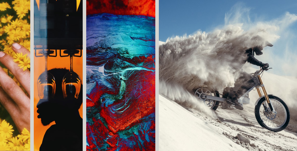
Explore Imagery with JPEG Artifacts on Stills